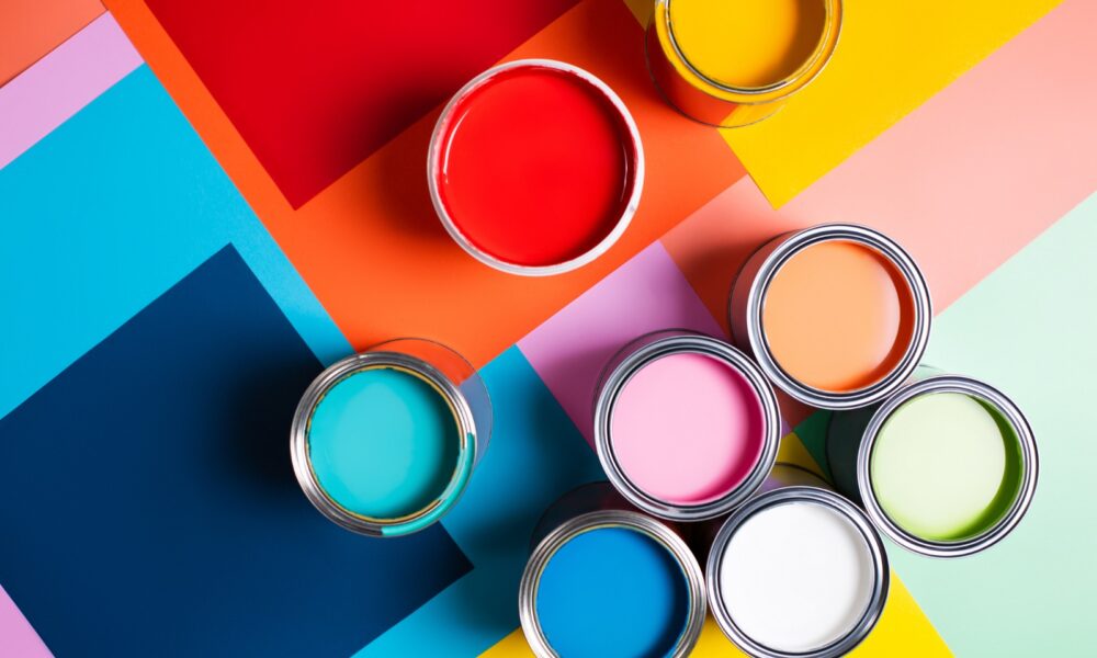
Understanding of colors and how they might reflect your brand’s identity

Color can account for up to 90% of an initial impression and Color may improve brand familiarity and awareness by 80%. Many major firms take advantage of this feature, spending considerable attention and care when selecting brand colors for logos and marketing materials. Effective and intentional use of color in branding not only shows good, but it can also help grab a target market’s attention – and business – in a quick and impactful way.
There are numerous hues, and research indicates that certain colors represent specific emotions. Of course, emotions have a significant role in consumers’ purchasing decisions. Let’s look at various color options and how to choose them.
BLACK Shows Mystery, Power, Grace
Black is the most commonly utilized color in luxury companies. Because the color represents strength and sophistication, it is ideal for more upscale brands. The color black can also represent security.
GREEN represents youthfulness, advancement, and stability
Green is commonly associated with nature, grass, and growth, and it is frequently used to signify a commitment to the environment. Green frequently conveys images of freshness, health, and all-natural features. However, darker tones of green might occasionally imply financial stability and affluence.
PURPLE symbolizes majesty and dominance, elegance
Purple is an elegant yet mysterious hue. Because it is associated with monarchy and refinement, it is most commonly used with higher-end products. Purple’s enigmatic element has often been associated with spirituality.
RED conveys Power, dedication, and eagerness
Red is often used in food marketing because of its capacity to arouse appetite. It is also known for its ability to represent strength, vitality, and confidence, and as a result, some of the world’s most powerful businesses employ the color.
YELLOW symbolizes intelligence, happiness, and enthusiasm
Yellow represents positivity, great energy, and hope. Many forward-thinking brands promote creativity and attract consumer attention. Yellow, in addition to being fun and lively, is frequently utilized to inspire a “happy” brand image for consumers.
PINK represents supporting innovation and Freshness
Pretty in pink is always the way to go for companies that want to stand out, be remembered, and feel eternally youthful. Pink has long been a prominent color in our business since it represents youth, pleasure, and femininity.
BLUE values respect, confidence, and cleverness
Companies use the color blue in their branding to create loyalty and suggest high levels of precision in work, which is also connected with intelligence and trust. Consider how many of today’s technology businesses use some shade of blue in their branding; this is not a coincidence.
Remember that the effect of your branding colors is determined by the style and manner in which they are employed, as well as the color combinations you select. Color in branding frequently elicits the following emotions among viewers.
When selecting branding colors, it’s crucial to align them with your brand’s values and target audience. A carefully chosen color palette not only conveys a message but also creates a memorable impression, reinforcing your brand identity. Test combinations thoughtfully to ensure the hues resonate with your customers’ emotions and perceptions.


